John Lewis
Identifying and delivering valuable features for John Lewis customers on their mobile app. Notably the reinstating of store finders, we identified through user feedback it was a highly requested feature despite its low use in previous versions.
User ResearchUI designMobile AppOur approach
At the time John Lewis was transitioning to their new iconic logo and branding from Pentagram and was moving to their new branding. Using existing components inline with Apple and Android best practices we balanced the native features of mobile app design and the John Lewis brand.
Working in an agile team we focused on delivering value and features each sprint lasting 2 weeks, progressing through a backlog into prioritisation and finally once selected into sprint to work on.
Our toolkit.
User testing.
John Lewis has a well established on-site lab at their London Victoria Head Office with some very talented testers. So our main focus was to build out the iterations to test for them to validate. We focussed on where and when do users expect to use this feature?
Design (Sketch).
The team had a well established template in Sketch along with a robust version control system in Abstract we could quickly build out multiple versions for the team to discuss as options. These included the iPad designs as well.
Prototype (Flinto).
We are a strong believer in making a test feel as real as possible, we could have had some code knocked up to test with but to reduce waste we jumped into Flinto to generate a fully working realistic prototype.
A deep dive.
Project – Store finder
Role – Lead Product Designer
April 2018
Opportunity
With the new John Lewis app in a minimal viable stage there was opportunity to return some of the features valued by its users.
Impact
Negative ratings and comments have fallen for the store finder feature and we also reached out to existing reviews to update their review in turn protecting the app rating overall.
Discovery
First we listened to our customers.
Established and identified needs through user feedback through monitoring the apps feedback, a common theme/ request was a store finder.
During the switch to the new mobile app the team identified that the store finder feature was not a priority due to low volume traffic and in the process removed it. The users wanted it back.
Competitor analysis.
In order to gauge how we should reimplement the store finder feature we looked at our competitors to understand how others have balanced the prominence of their store finder.
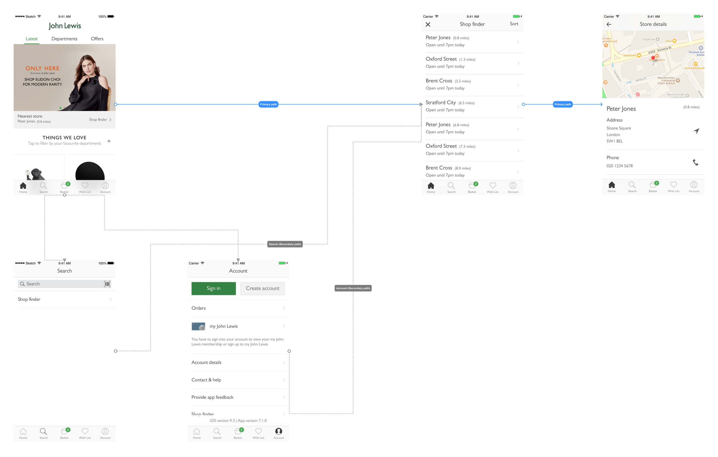
After a short workshop we had quickly identified three main areas that the store finder could be logically located.
Homepage.
This seemed like a strong place to locate the store finder, after all a user that has opted to use the John Lewis app instead of a search engine has this one primary goal in mind. Of course the homepage is our shop window, we needed to be careful not to cannibalise sales or distract users say to day.
Account.
Through the competitor analysis we noticed that some placed this feature under their account section. This didn’t feel quite right to me but identified as a candidate for the future user testing.
Search.
Just like using Google the John Lewis app has a search functionality, allowing users to search for anything and dynamic results would be displayed. Our hypothesis was that if a link was placed in the search results would users find it?
Design.
We set to work, using Sketch we started by designing the core functionality of the store finder list and then the store finder page.
The store list would be defaulted to distance as our research showed users would search for a store when “out and about” most often.
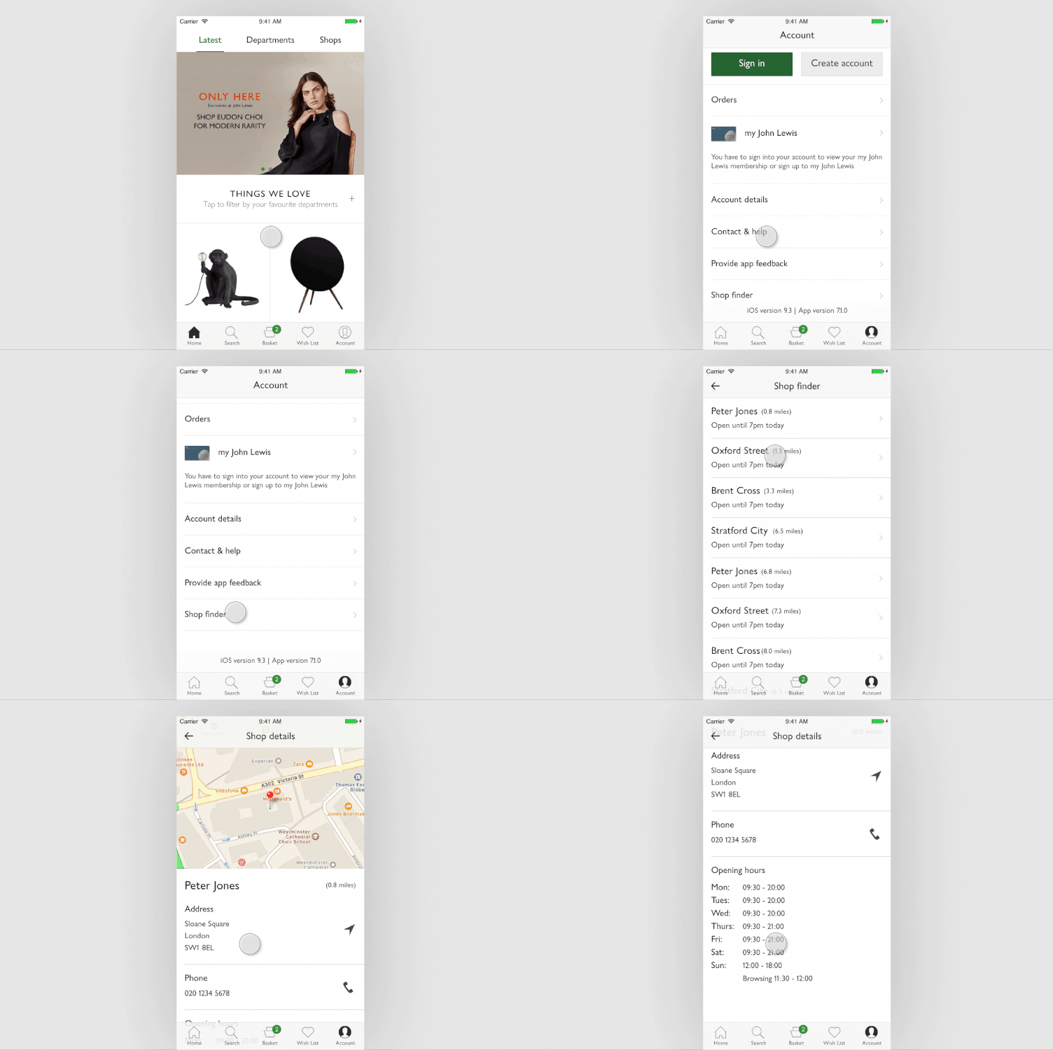
The store details page was distilled down to a pinned map location, name, distance, address, phone number and opening times.
To improve the affordability of the design we added device appropriate icons according to iOS and Android standards to signpost to users that they can tap on this information to interact with. We would also programme the interaction to a relevant app such as the phone icon would bring up the dialler with the number pre-filled for the users convenience.
User flows.
The user flow shows the entry points with the primary path form the homepage
User Research – A combination of informal unstructured interviews, card sorting and task orientated prototypes.
Throughout the day we had 6 participants into the John Lewis User testing lab. We started the session with some basic questions to get an unfiltered an opinion of location for where they would expect to see the store finder.
The session moved onto users being tasked to find a store on a mobile device and to relay information such as distance and opening hours.
Exploration.
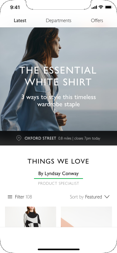
We continued to explore homepage options, striking the balance of store information and maintaining the new minimal branding.
Conclusion & Impact
Through testing we identified that store finders are seen as ‘hygiene’ elements to a company, they comfortably sit in the minimal expectations and when they aren’t there, the users will let you know. The test found that users had split expectations on where they would expect to find the store finder.
All 6 users found the homepage element and preferred the option with distance included. 5/6 users located the store finder on search and only 1/6 found it under the account section.
Since launch there has been significant drop in low star reviews and negative comments about the store finder missing and has helped increase the star rating of the app overall as we engaged with users to update their ratings.


